DAILY NOSH
UX/UI Design for machine learning grocery app.
ROLES AND RESPONSIBILITIES
My primary role was to design the UI and manage all content for the Daily Nosh. It also included designing the flows for the fridge scan and past order features.
OVERVIEW
The daily nosh is a grocery delivery app that uses machine learning. It uses AI and machine learning to customize recommended recipes and shopping lists based off of its scan fridge feature.
PROBLEMS NEEDING SOLVED
The Daily Nosh had already done the discovery and define stages of the design process and presented me with style tiles, moodboards, personas and wireframes. The main problems that I was tasked with solving were:
How to implement the brand with consistency and appeal to the target market?
How will the app know what items the users have in their fridge using AI?
How will users reorder items from previous shopping trips?
TAKING INVENTORY
Using existing wireframes as reference, I made an Interface Inventory to help visualize and streamline the components I would need,
I then updated them to match the style tile that was given to me.

WIREFRAMES
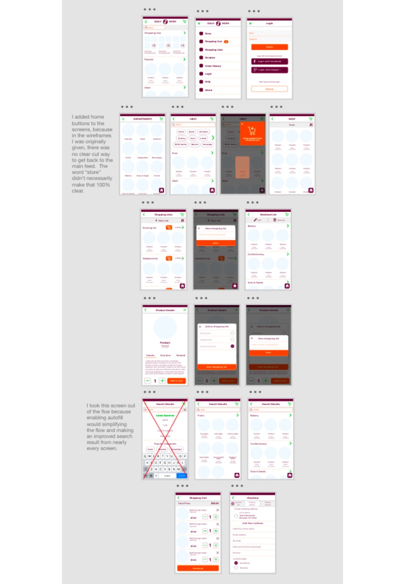
I started immediately rebuilding the wire frames from the screenshots I was given. I also made a few small adjustments such as taking out a suggested search page, insisting that instead autofill be enabled, so an easier search could be used from any page with a search bar. I also added a home button to easily get back to the main feed, as it wasn’t 100% clear how to navigate back in the wireframes.
HIGH FIDELITY

I then started gathering appropriate content
for the app and began implementing it.
MOOD BOARD

After receiving input that the project needed to have the colors pop more and be more trendy, I updated the mood board, and added additional colors to the component library,
FRIDGE SCAN FEATURE
I researched the Samsung Smartfridge and Yummly app for inspiration. Unlike past projects, I did not sketch out my ideas as I had a very clear vision, and with the components already made for the app, I already had many of the building blocks. to get to work.

PREFERENCE TEST

Some designs were “too busy”, and others were “too plain”, but the design that was preferred seemed “just right” The Goldilocks of the Daily Nosh. The bottom navigation was also a big hit.

INCORPORATING ELEMENTS ELSEWHERE

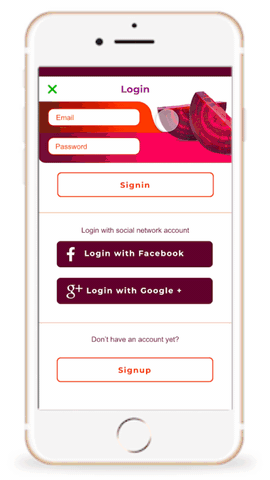
Although not the winner, a total of 42% of users selected one of the designs with the beets in them, and many commented on the look and fun colors, but according to the feedback, most selections were made on what testers found the most usable.
The feedback told me that I could still incorporate these elements, but not on such a busy page, so I added them to the login screen to really kick in the branding, but in a more appropriate way.
PAST ORDERS
I modified the wireframes to function more like the rest of the site, and so multiple past orders could be seen at once. Past orders can be found easily through the main navigation bar on the bottom of the screen.
A single button can add all items from a past order to the cart, and if the Daily Nosh is out of stock, it will automatically suggest similar items as substitutions.

TESTING
I did a quick discovery test with three testers. I was primarily testing the past order flow, but also discovered a few other things along the way.

The past order flow was easy to locate and find products for %100 of testers.
All testers also understood how to add the entire past order back into the cart.

ITERATION

During this test, I discovered a few things that needed to be fixed, such as broken links and spelling errors, so I fixed those.
I also removed the menu squares as I realized that they were an unnecessary design element, and changed order history to past orders to make sure language was consistent throughout the app, and deleted the excess recipe menu item..
CONCLUSION

The new fridge scan and past order flows tested well, and I received positive feedback on the overall look and usability of the site.
When asked if testers would use this app, these were the responses:
